
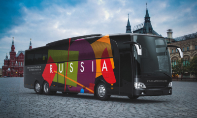
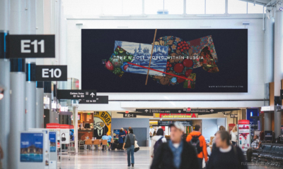
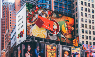
THE WHOLE WORLD WITHIN RUSSIA
A competition for a new Russian brand identity was launched in 2015 and anyone could participate. Experts went through 480 logos and 600 slogans. Then in 2016, the Federal Agency for Tourism of the Russian Federation organized the second round of the competition with the support of the Ministry of Culture of the Russian Federation and the Association of Branding Companies of Russia. Branding industry professionals then developed 30 different concepts for Russian tourism brand identity.
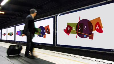
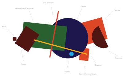
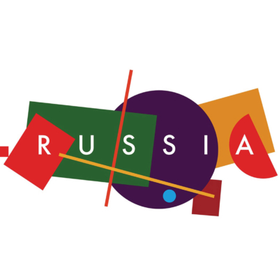
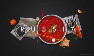
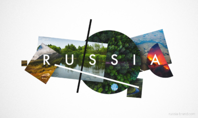
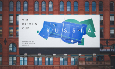
The winning identity and its slogan “the whole world within Russia” was created by a team of designers from four different Russian agencies: Suprematika, Plenum, Artonika and Art.Lebedev. They started with a concept: “Russia is tremendous and vast. It has everything one can imagine: from subtropical to Arctic regions and climates, from the deepest lakes to the highest peaks. The truth is, Russia is not only huge in sheer size, but in other aspects as well – it stretches from the past to the future, comprising multiple cultures and preserving thousands of stories and memories. Traveling across Russia is more than just a travel. It is an endless discovery!” The designers developed a logo made of up basic geometric shapes, which loosely form a map of Russia. Each of the 10 shapes represents a different place and territory, and they are presented in block colours of red, green, purple and orange. Interestingly, it includes Crimea – a former part of Russia that was annexed in 2014.
“This is a pretty simple graphic approach that shows the country’s diversity – sometimes complicated and bulked, sometimes totally empty, like an incoherent patchwork quilt,” said Vladimir Lifanov, who is creative director of Suprematika. “This concept is a good example of how anyone can express his perception of a homeland,” he continued. “This is how I see it: complicated mixed with simple, monochrome and colourful, round, and angular.”

All Rights reserved to Russia-brand
(via dezeen)